
Bankers Fidelity
Insurance Applications
My Roles:
Product discovery, user interviews and surveys, comparative and competitive research, sitemapping, wireframing, high fidelity prototyping, collaboration with stakeholders, compliance and development teams, user testing, iteration, insurance of compliance with FAA standards
The Challenge:
The company was still using the process of submitting paper applications. Our third party sales agents who sell products for multiple companies were growing frustrated at the lack of technology. Getting the application process online was crucial for sales.
This project was two years into development when I signed on. With no previous UX Designer on the project, most of what had been developed was completely unintuitive and unusable.
This is what the original platform looked like and it desperately needed an overhaul. →

Research:
-
Meet with key stakeholders to get the full list of requirements, expectations, and pain points about what had been going wrong.
-
Test out the sandbox to see what had been developed and what the functionality was.
-
Conduct surveys and interviews with our users, the agents, to find out their needs and pain points. Find out what other insurance carriers platforms they like best and do competitive analysis.
The Target User:
Male aged 35 - 65
Independent 3rd party agent who writes business for multiple insurance companies
-
Works solely on commissions
-
Travels 100% of time to meet with clients
-
Number one priority is a quick application process
-
The quicker the application process, the more clients he can meet with in a day
-
Older agents lack computer savviness

Solutions:
Address functionality issues
I worked with the development team to fix backend issues like product rates not properly calculating, broken if/then and parent/child logic, buttons not working, required notices not populating, the DocuSign process not linking, etc.
Clean up the UI
Colors and fonts were changed to be in compliance with brand guidelines. FAA standards were also insured.
Define Parent/Child Logic

Redo page layouts
Re-organizing the layout of pages to made them clean and concise andhelped our users to easily locate information and execute aplications quickly.
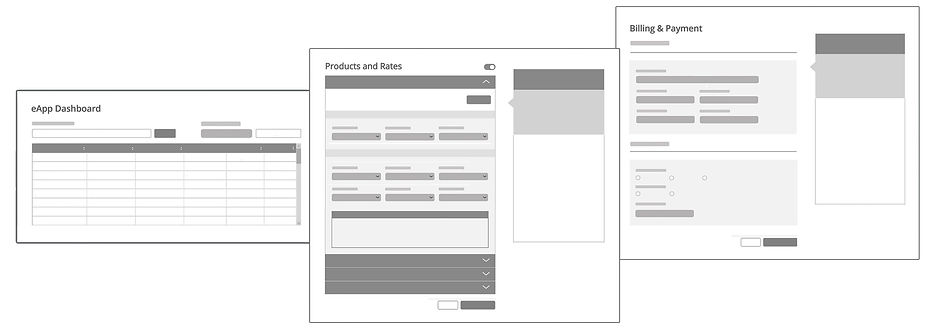
Iterate, iterate, iterate:
Building an application for our insurance products was extremely complex. We had a great deal of variable logic to account for different state regulations, discounts, and notices. Often what made sense when building one product, din't make sense for another. Working in an agile fashion, we constantly made adjustemnts to to the platform that would allow the user to have a universal experience across all products.
User testing and more iteration:
Once we had a product that was functioning, we brought in our field agents for first round of testing. Based on agent feedback, we found that we were heading in the right direction but we also learned some desires from agents that could make our product more competitive:
"Could you add the ability for the tab button to advance to the next form field? That really speeds things up for me."
"The lack of an auto save feature is a real problem. If Iaccidentally hit the back button, I could lose hours of work."
"A customizable option to choose how many questions I see per page would be ideal."
"Another company I write business for has product guide links at the top of application pages for reference. I really like that."
The Final Product:

